The Art of Color: Transforming Your Design Layouts
Color is more than just decoration—it’s one of the most powerful tools in design. The right palette can guide the eye, set the mood, and even influence decisions. Whether you’re crafting a digital painting, a fashion ad, or a magazine spread, understanding color use can elevate your work from good to unforgettable.
1. Start With a Purpose, Not Just Preference
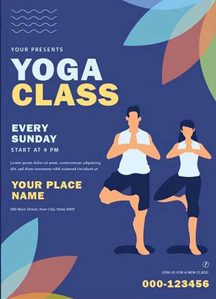
Every color has a psychological impact. Blue evokes trust and calm (think corporate brands and health care), while orange suggests energy and creativity—perfect for entertainment or youth-oriented content. Before picking colors you “like,” ask: What story should this layout tell? What emotion should it spark?
2. Use Contrast to Lead the Eye
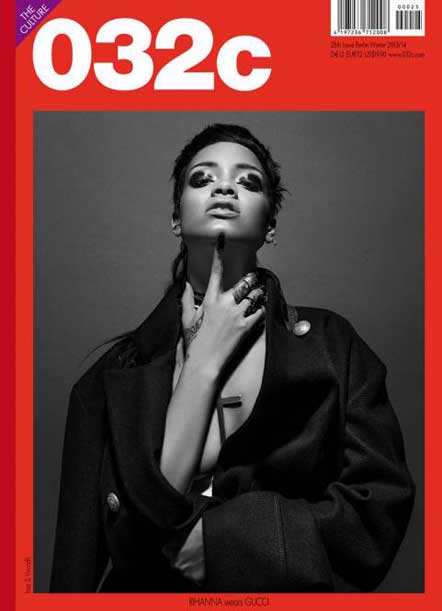
Contrast creates hierarchy. Pair a bold accent (like bright orange) against a calm neutral (like soft gray or white) to draw attention where you need it—headlines, call-to-action buttons, or focal images. Avoid using multiple strong contrasts in one place; it can overwhelm your audience.
3. Limit Your Palette for Harmony
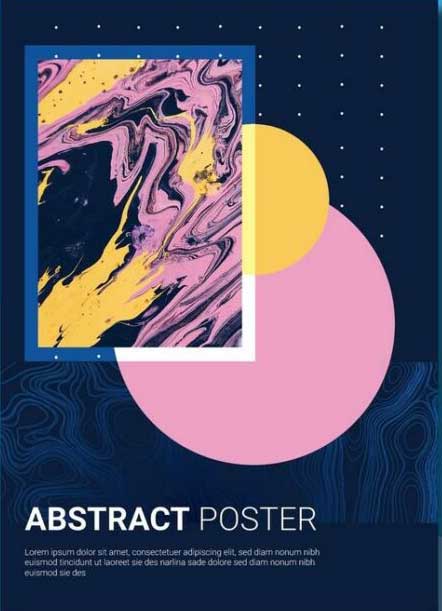
Two to four primary colors are usually enough for most layouts. Using too many hues can make a design look busy and unprofessional. Tools like Adobe Color or Coolors can help you find harmonious combinations, whether you’re working with complementary colors (blue and orange) or analogous ones (blue, teal, green).
4. Remember Cultural Context
Colors carry different meanings in different cultures. Red may symbolize good luck in China but can signal warning or danger elsewhere. If your design targets a diverse or global audience, research cultural associations to avoid unintentional messages.
5. Test on Different Screens and Lighting
Colors can shift across devices and environments. A bright green on your monitor may appear muted on a phone or projector. Preview your design in different formats before finalizing it—especially for digital layouts or print materials.
6. Use White Space as a Color
White (or negative space) is not empty—it’s an active design element. Strategic use of white space makes colors pop, improves readability, and gives your layout a modern, professional feel.
7. Stay Trend-Aware, but Stay Authentic
Color trends (like neon gradients or earthy pastels) can refresh your work, but they should serve your brand or project’s identity—not dictate it. Blend trends with your own style to create designs that feel both current and original.
Final Thought:
Color is like music—it has rhythm, emotion, and power. Mastering its use takes observation and experimentation. Next time you open Photoshop or sketch a layout, treat your palette as a storytelling tool. Your colors won’t just fill the page—they’ll speak volumes.
Learn with Lifeplus—the dedicated training unit of Lifeplus Enterprises—brings you practical, creative learning resources to spark your talent. From online classes you can join from anywhere to hands-on, onsite workshops, we help you master graphic design, video editing, and digital creativity. Let’s grow your skills together—call us today at 9477764615.